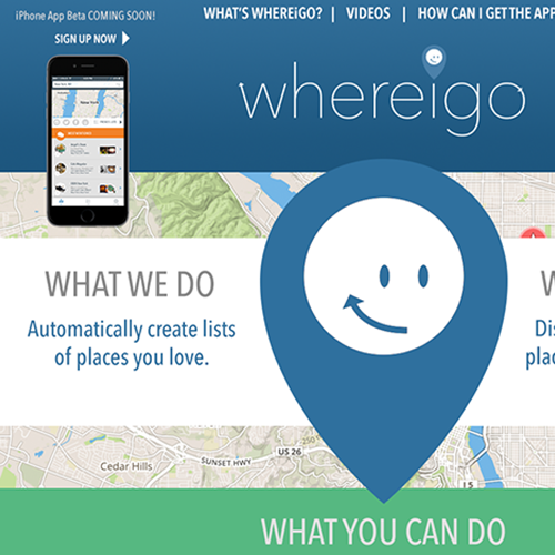
WHEREIGO APP UX/UI, LOGO, ICON, & WEBSITE DESIGN
The Whereigo team needed re-branding, a website and, most-importantly, UX/UI design to bring the iPhone app to Beta for funding. Designing the app was a great challenge as the app’s features were shifting during the design process. But, being a part of the functional strategy and working collaboratively with the development team was very rewarding and allowed for smooth pivots. All branding elements needed to be created quickly as well: from color palette and fonts to the icon and logo.
Click an image to zoom


